Chapter 2 Updates
After updating my python driver late last week, the no-loading run for Chapter II has been running smoothly on klone! I will begin quantifying noise next week after there is a full year of simulation data. This week I also spent some time brainstorming potential experiments and analysis to conduct as part of Chapter II. More details below.
Verifying that the model is behaving
As a reminder, Parker is running a new long hindcast with updated WWTP data and improved biogeochemistry. This hindcast also serves as the “loading” condition of my Chapter II WWTP experiment. The run was initialized on model day 2012.10.07.
I am presently running a “no-loading” condition in which I have set the nutrient concentrations of each WWTP to zero. This run is otherwise identical to Parker’s run.
As a quick check, Figure 1 shows the daily average DIN difference between the two models at the surface (left) and bottom (right) after one day of run time. Blue means that the “loading” run has higher DIN concentrations than the “no-loading” run. As we would hope, there are higher DIN concentrations in the “loading” run near the WWTPs.
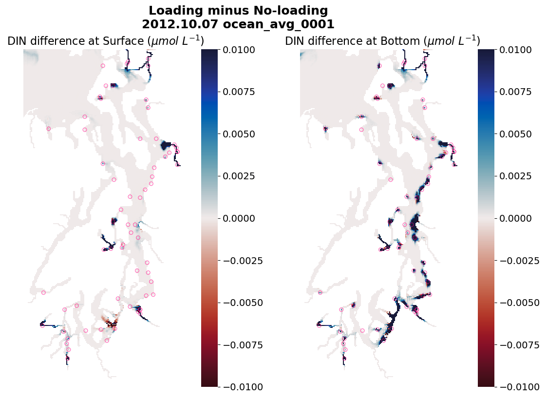
Fig 1. Comparison of daily average DIN concentration after one day of run time between the two runs (loading minus no-loading). The left panel shows surface differences. The right panel shows bottom differences. The pink circles denote locations of WWTPs
As a second sanity check, I verified that the hydrodynamics are bit-reprodudible betweent the two model runs after several months of run time. Figure 2 confirms that v-velocities are the same in both runs after 6 months of model time across the entire model domain.
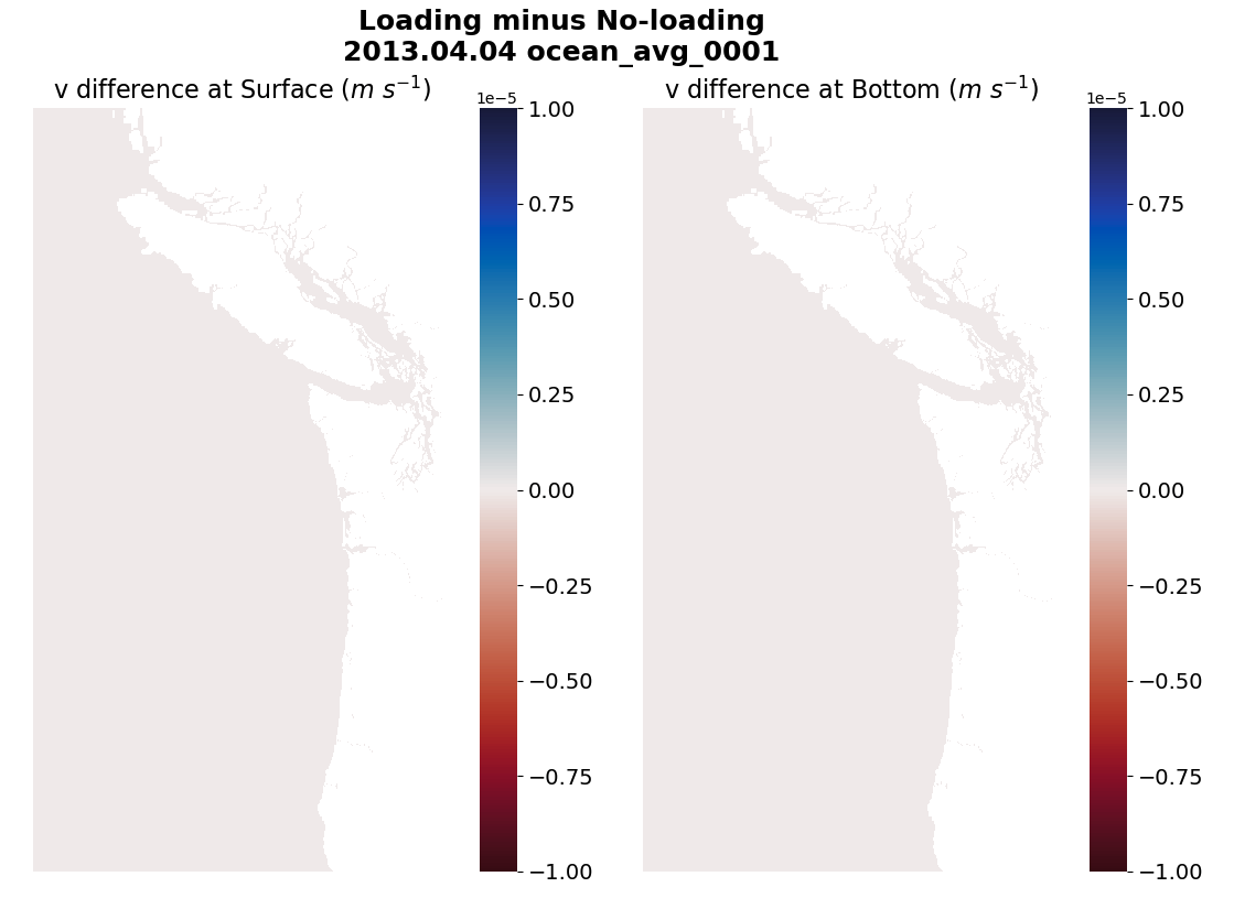
Fig 2. Comparison of daily average v-velocities after six months of run time between the two runs (loading minus no-loading). The left panel shows surface differences. The right panel shows bottom differences.
As expected, noise is still present
I also looked at the differences in DIN across the entire model domain after six months of run time and noticed that noise is still present in our results (Figure 3). It is most apparent near the boundary of the model domain. Note that the colorbar limits are rather small. This noise is not a surprise, and I intend to investigate and quantify this noise after the simulation has run through the remainder of 2013.
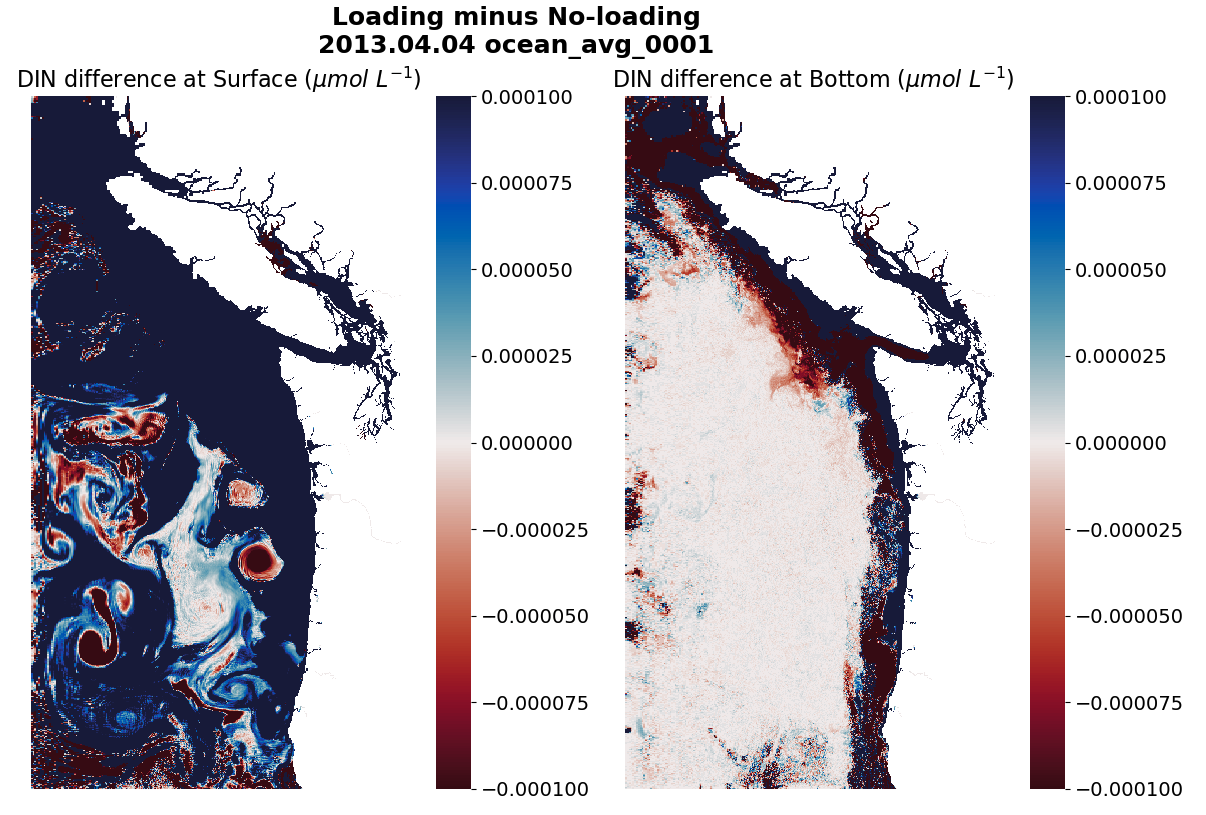
Fig 3. Comparison of daily average DIN concentrations after six months of run time between the two runs (loading minus no-loading). The left panel shows surface differences. The right panel shows bottom differences.
Ideas for Chapter II analysis
Currently, the no-loading run is running through the end of 2016 and outputting daily averages. Since 2017 is a roughly median hypoxic year, and because it was my focus year for Chapter I, we discussed conducting more rigorous WWTP loading / no-loading experiments for 2017.
We’ve previously discussed the idea of adding dye to West Point at the start of 2017 and monitoring where it goes. Coincidentally, while investigating the noise issues this past summer, I’ve spent the last couple of months learning how to add dye to ROMS. Why don’t we take advantage of this new skill? Rather than only adding dye to West Point at the start of 2017, I can add 87 unique inert passive tracer dyes to all 87 WWTPs in the model domain (Figure 4). The dye will have the same concentration and discharge rate as the nutrients. This way, every WWTP gets its own tracer. I can even “dye” the nutrients coming in from the ocean boundaries and the rivers. Launching this huge dye release experiment will allow us to answer questions such as: “What are the largest sources of nutrients entering Hood Canal, and in what proportion are they present?”
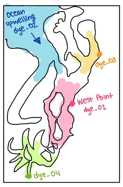
Fig 4. Sketch of multi dye-release experiment in Puget Sound, and a made-up result of dye plume extent.
We don’t need to analyze the trajectory of dye from all 87 WWTPs. It might be more informative to quantify the top 5 largest sources of nutrients (e.g., ocean or specific WWTPs) in each of the hypoxic terminal inlets– or some other analysis of this nature (Figure 5).
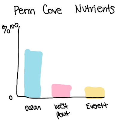
Fig 5. Made-up example bar chart showing the proportion of nutrients entering Penn Cove from different sources.
Ultimately, the “87 unique dye release” experiment sounds relatively easy to implement (for loops, yay!), and it would provide us with many different options for quantifying and exploring where WWTP effluent ends up in Puget Sound. The additional benefit of this experiment is that the dyes are inert and passive tracers– so they will not interact with each other and they will not interfere with the loading / no-loading biogeochemistry experiment that we are already conducting. The flaw in this plan is that it will likely take an immense amount of time to write 87 additional state variables to the output file. Perhaps we can pare down the experiment to just a few new dye variables, with WWTPs grouped by sub-basin (e.g., South Sound WWTPs all discharge the same dye).
Also recall that we need hourly output to conduct any type of TEF or budget analysis (and writing hourly output takes ROMS twice as long to run compared to writing daily averages). We might not need hourly output for a massive dye-release experiment, but this is something to keep in mind as I continue to think about analysis plans.