Sub-basin Integrals
Before the holidays, Kate and I came up with some initial analysis plans for the WWTP loading experiments. My primary objective was to assess how different sub-basins in Puget Sound respond to the WWTP loading. Though I haven’t completed everything on our checklist, here is a quick update on what I have so far.
Sub-basin definitions
In addition to looking at the whole of Puget Sound, I also extracted data for Hood Canal and South Sound. The box extraction tool that Parker developed extracts LiveOcean data within a box shape. It proved impossible to draw a single box around Hood Canal and South Sound basins that did not include some rogue inlets from other sub-basins. Thus, I extracted three separate boxes: “Upper Hood Canal”, “Lower Hood Canal”, and “South Sound + Lower Hood Canal” (Figure 1).
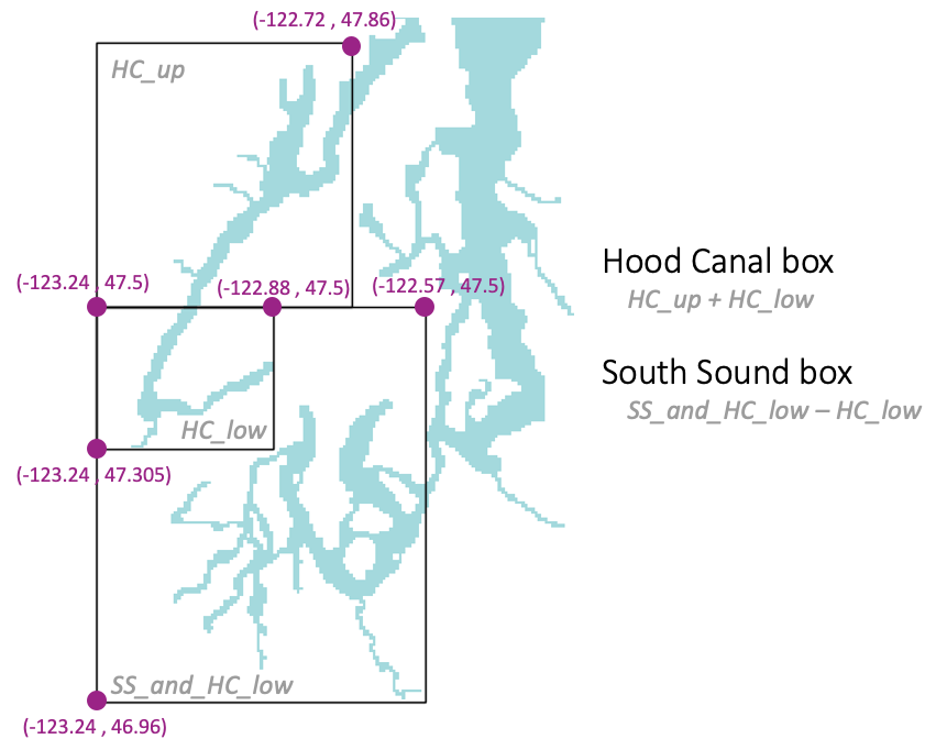
Fig 1. Box extraction locations.
For the rest of this blog post, Hood Canal corresponds to the sum of the upper and lower Hood Canal boxes. Similarly, South Sound corresponds to the “South Sound + Lower Hood Canal” minus the “Lower Hood Canal” box. Note that I subtracted the data corresponding to the grid cells in lowest latitute of the “Upper Hood Canal” box. Doing so prevents us from double counting the grid cells at the boundary between the upper and lower Hood Canal boxes.
Because Whidbey Basin does not fit into a box easily, I did not include it in this analysis. However, I can always find a way to extract Whidbey Basin data in the future if necessary.
Hypoxic volume
Over the whole of Puget Sound, the latest version of LiveOcean estimates much less hypoxic volume for the years 2014-2017 compared to the previous version of LiveOcean (Figure 2).
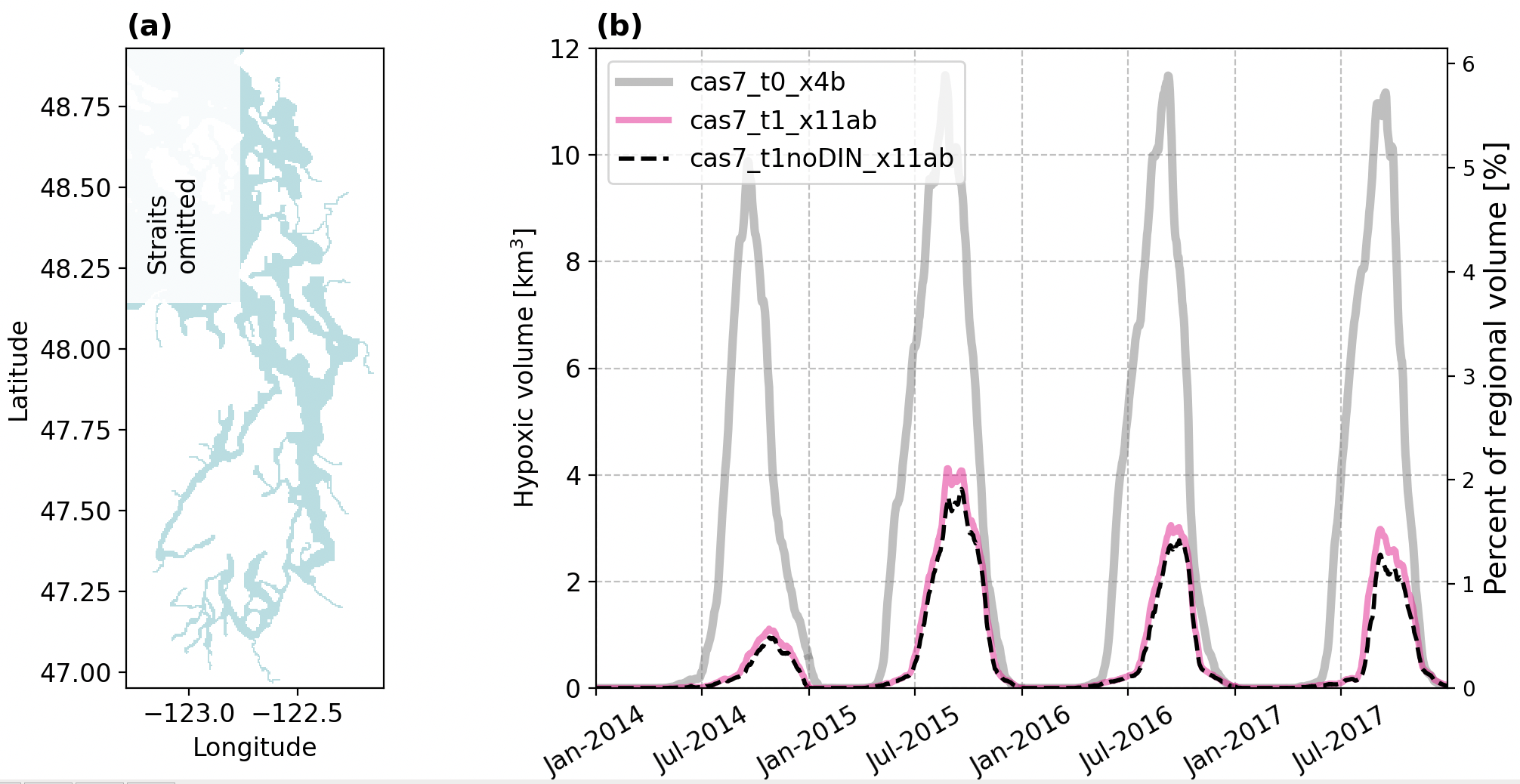
Fig 2. Puget Sound hypoxic volume time series. The grey line corresopnds to the old version of LiveOcean (known to underestimate DO concentrations). The pink line corresponds to the latest version of LiveOcean, and the dashed black line corresponds to the latest version minus WWTP nutrient loads.
When we consider just the new version of LiveOcean and look at Hood Canal and South Sound sub-basins, we find that the total hypoxic volume across the whole of Puget Sound is almost entirely due to hypoxia within Hood Canal (Figure 3).
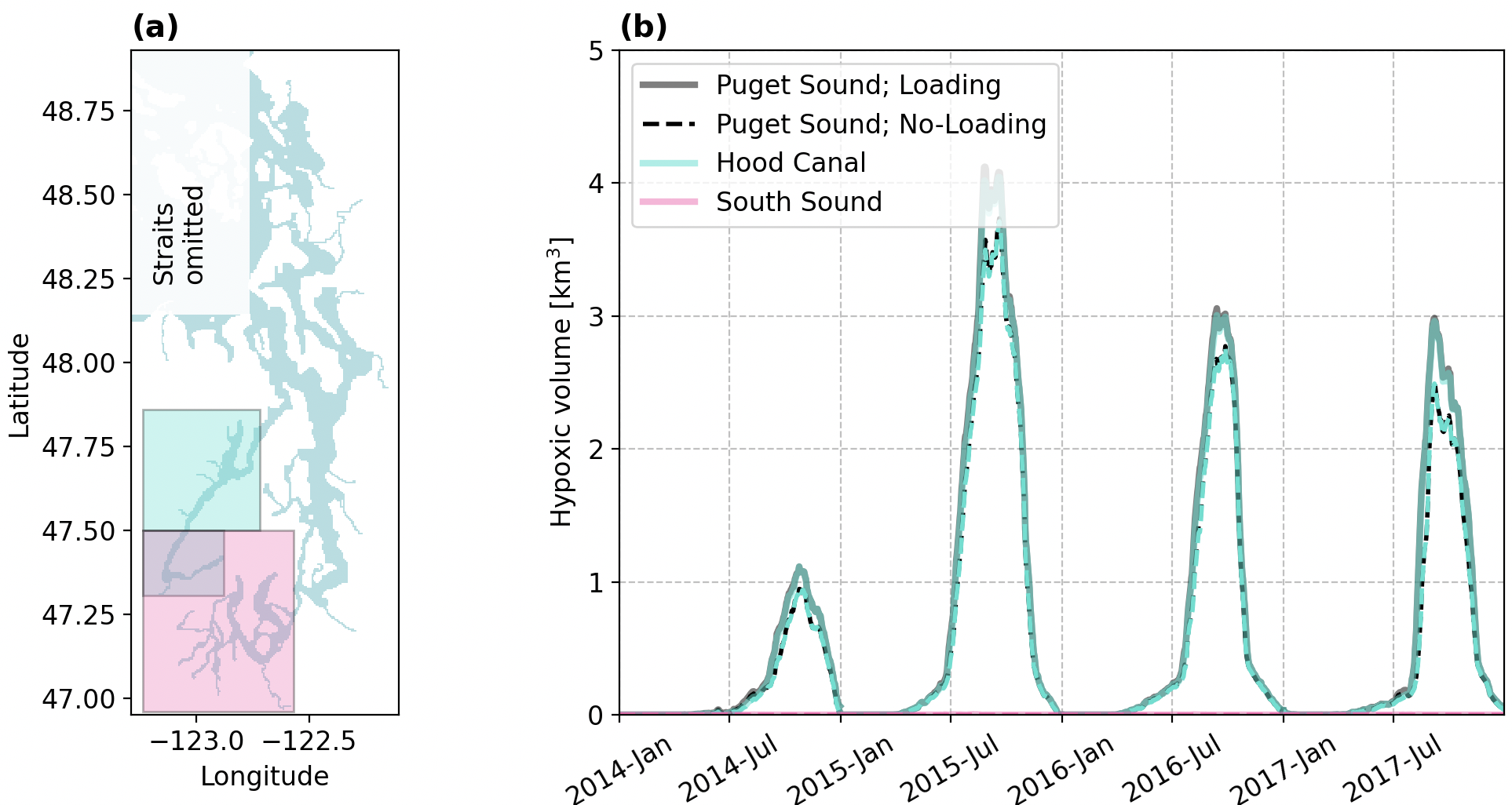
Fig 3. Hypoxic volume time series of Puget Sound, Hood Canal, and South Sound.
NPZD+O volume integrals
Lastly, I plotted volume integrals of each of the NPZD+O parameter over each basin. These figures are a work in progress, so for now I am only showing volume integrals of NO3 (Figure 4). Apologies for the messy and overlapping labeling.
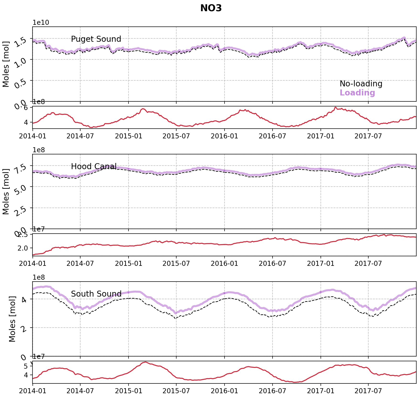
Fig 4. NO3 volume integrals in Puget Sound, Hood Canal, and South Sound from 2014-2017. The purple line corresponds to the loading run, and the dashed black line corresponds to the no-loading run. The difference between the runs (loading minus no-loading) is plotted in red below each panel.
The difference between the loading and no-loading runs (red lines) have a seasonal cycle.
The NO3 deficit between the runs appears to still be growing at the end of 2017 in Hood Canal. This result suggests that Hood Canal takes quite some time to adjust to loading changes in the whole of Puget Sound.
The plots are still a first pass at analysis, and I’m looking forward to chatting more and making a bigger dent in my list of to-dos.