NPZD+O basin averages
This week I revisited my exploration of the spatial distribution of the NPZD+O variables across the different basins. A big thank you to Kate for helping with the masking scripts that partition Puget Sound into its sub-basins.
My major takeaways from this analysis so far are:
- South Sound has the highest DO concentrations and the largest amount of phytoplankton growth.
- In general, WWTP loads seems to increase nutrient concentrations, delay and intensify phytoplankton blooms, and decrease DO.
- Hood Canal has the lowest DO concentrations and the least phytoplankton growth of any basin, and WWTP loading has the smallest impact on Hood Canal in terms of nutrient and phytoplankton concentrations. However, WWTP loading causes a spatially uniform DO response in all basins (including Hood Canal) during the summer. My hypothesis is that detritus produced in the other basins gets advected into Hood Canal where it subsequently gets consumed.
- Whidbey Basin and Main Basin have similar NPZD+O profiles in the no-loading run, but their respones to WWTP loading diverges
- WWTP loading increase Main Basin NH4 concentrations twice as much compared to Whidbey Basin
- Whibey Basin’s DO response to WWTP loading is most similar to Hood Canal’s
More details of the analyses are below.
NO3 and a description of figures
All of the figures in this blog post are formatted the same way. Let’s consider Figure 1 as our example. Panel a shows how I have partitioned Puget Sound into its distinct sub-basins. I have also added circles to indicate the locations and sizes of WWTPs discharging to the region. Panel b shows the average concentration of NO3 in the no-loading run in each basin. This was calculated by integrating the total amount of NO3 in each basin, then dividing by basin volume. Panel c shows the difference in the average NO3 concentration between the two runs. I subtracted the no-loading run from the loading run, so positive values indicate that the loading run has more NO3. Conversely, negative values indicate that the loading run has less NO3. I applied a 20-day Hanning Window filter to the time series in panels b and c.
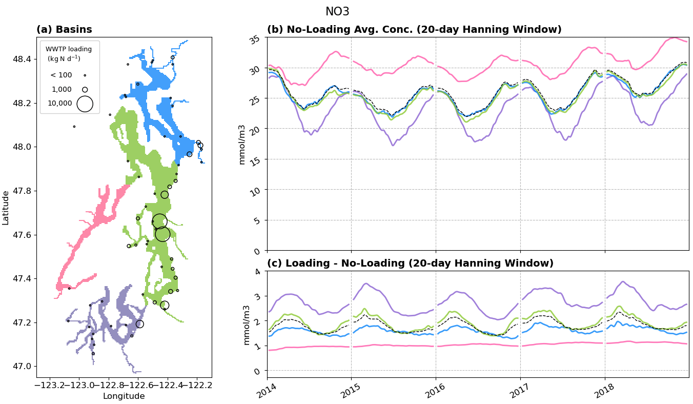
Fig 1. Average NO3 concentration in the different basins of Puget Sound. (a) Delineation of basin boundaries and location & discharge of WWTPs. (b) Average concentration in the no-loading run, partitioned by basin. The black dashed line represents the whole of Puget Sound. (c) Difference between the loading run and no-loading run average concentrations.
In the no-loading run, Whidbey Basin and Main Basin have similar concentrations of NO3, Hood Canal has the highest concentration of NO3, while South Sound has the least amount of NO3 (Figure 1b). Because South Sound NO3 concentration dips during the summer and increases to match Whidbey/Main Basin concentrations during the winter, then I suspect South Sound’s low NO3 concentrations are due to phytoplankton uptake.
WWTPs increase NO3 concentrations in all basins, but has the least effect in Hood Canal (where there is no seasonal variability), and the most impact in South Sound (where there is more pronounced seasonal variability) (Figure 1c).
Throughout 2014, the difference in NO3 still appears to be increasing between the two runs (Figure 1c). This growth seem to level-off in the subsequent years.
NH4
In the no-loading run, all basins have similar concentrations of NH4 with similar seasonal patterns (Figure 2b). Hood Canal’s seasonal variability has the smallest amplitude relative to the other basins.
WWTPs generally increase NH4 concentrations in all basins (Figure 2c). Main Basin and South Sound are the most impacted. I hypothesize this is because the largest WWTPs are located at the bottom of Main Basin, and these bottom discharges get transported southwards by the exchange flow. Hood Canal has the least impact from WWTP loading, with concentration increases during the summer months only– presumably due to remineralization of organic matter throughout the growing season.
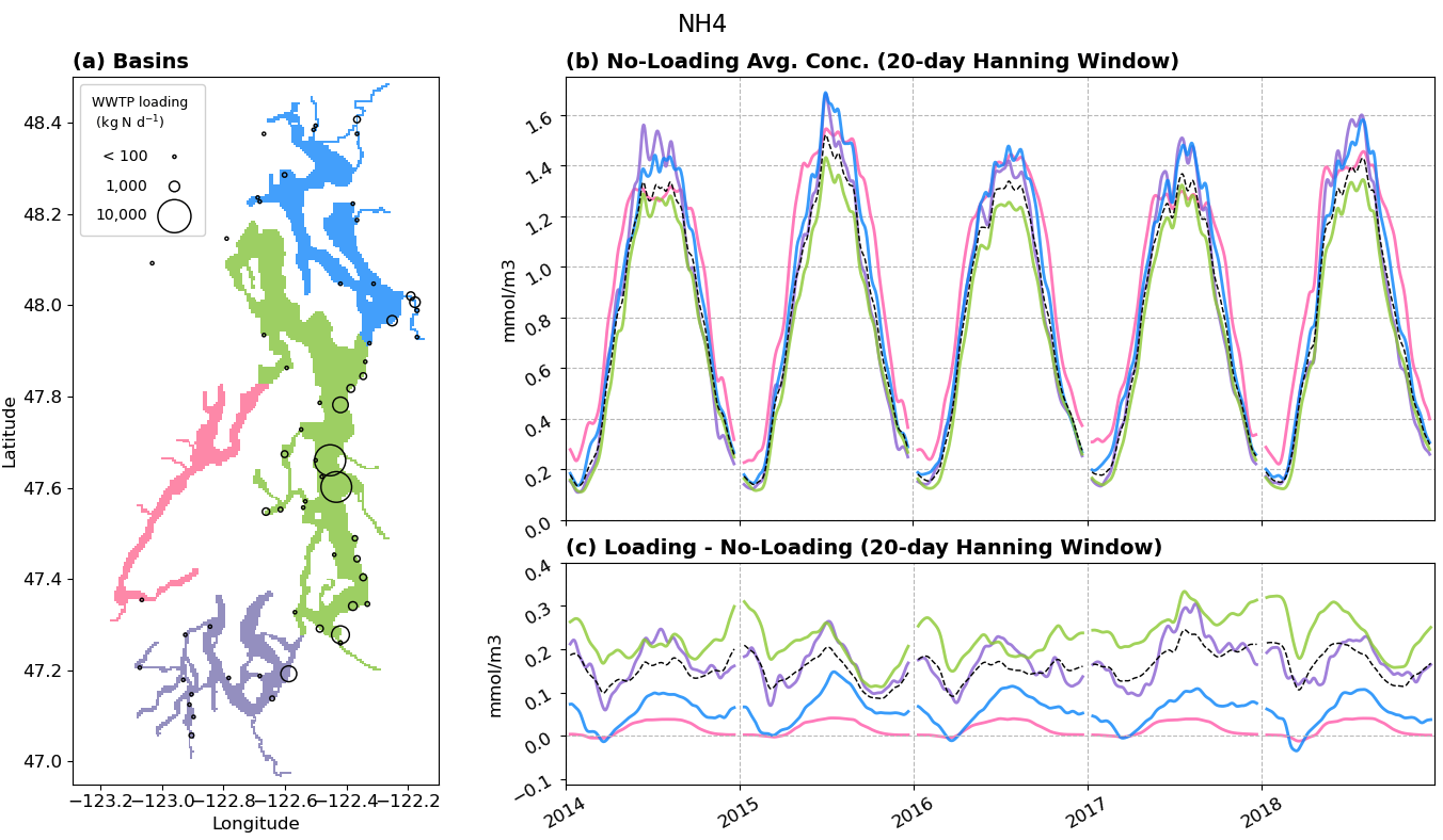
Fig 2. Average NH4 concentration in the different basins of Puget Sound. (a) Delineation of basin boundaries and location & discharge of WWTPs. (b) Average concentration in the no-loading run, partitioned by basin. The black dashed line represents the whole of Puget Sound. (c) Difference between the loading run and no-loading run average concentrations.
Phytoplankton & Zooplankton
In the no-loading run, there is the least amount of phytoplankton growth in Hood Canal, three times more in South Sound, and middle levels in Whidbey and Main Basins (Figure 3b). These patterns are consistent with the lower summer NO3 concentrations in South Sound, and generally higher NO3 concentrations in Hood Canal.
WWTP loading appears to delay the onset of phytoplankton blooms in South Sound, Whidbey Basin, and Main Basin (Figure 3c), as indicated by the negative difference values near the start of the year. The blooms also appear to be more intense, as indicated by the positive difference values during the summer. I am not sure why increased loading causes this change in bloom timing. I am also curious whether the total amount of phytoplankton differs between the two runs, which I can investigate using cumulative sum plots in the future. It is worth noting that Hood Canal phytoplankton blooms are minimally impacted by WWTPs relative to the other basins. I wonder whether the Hood Canal summer increase in NH4 (Figure 2c) is thus due to NH4 being advected into Hood Canal from Main Basin.
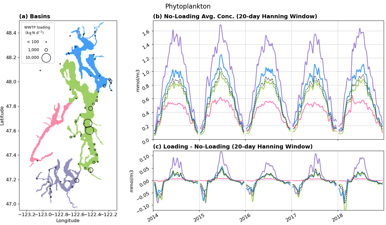
Fig 3. Average phytoplankton concentration in the different basins of Puget Sound. (a) Delineation of basin boundaries and location & discharge of WWTPs. (b) Average concentration in the no-loading run, partitioned by basin. The black dashed line represents the whole of Puget Sound. (c) Difference between the loading run and no-loading run average concentrations.
Zooplankton trends are shown in Figure 4, but I do not have much commentary to add. Zooplankton patterns across the patterns largely follow the phytoplankton patterns.
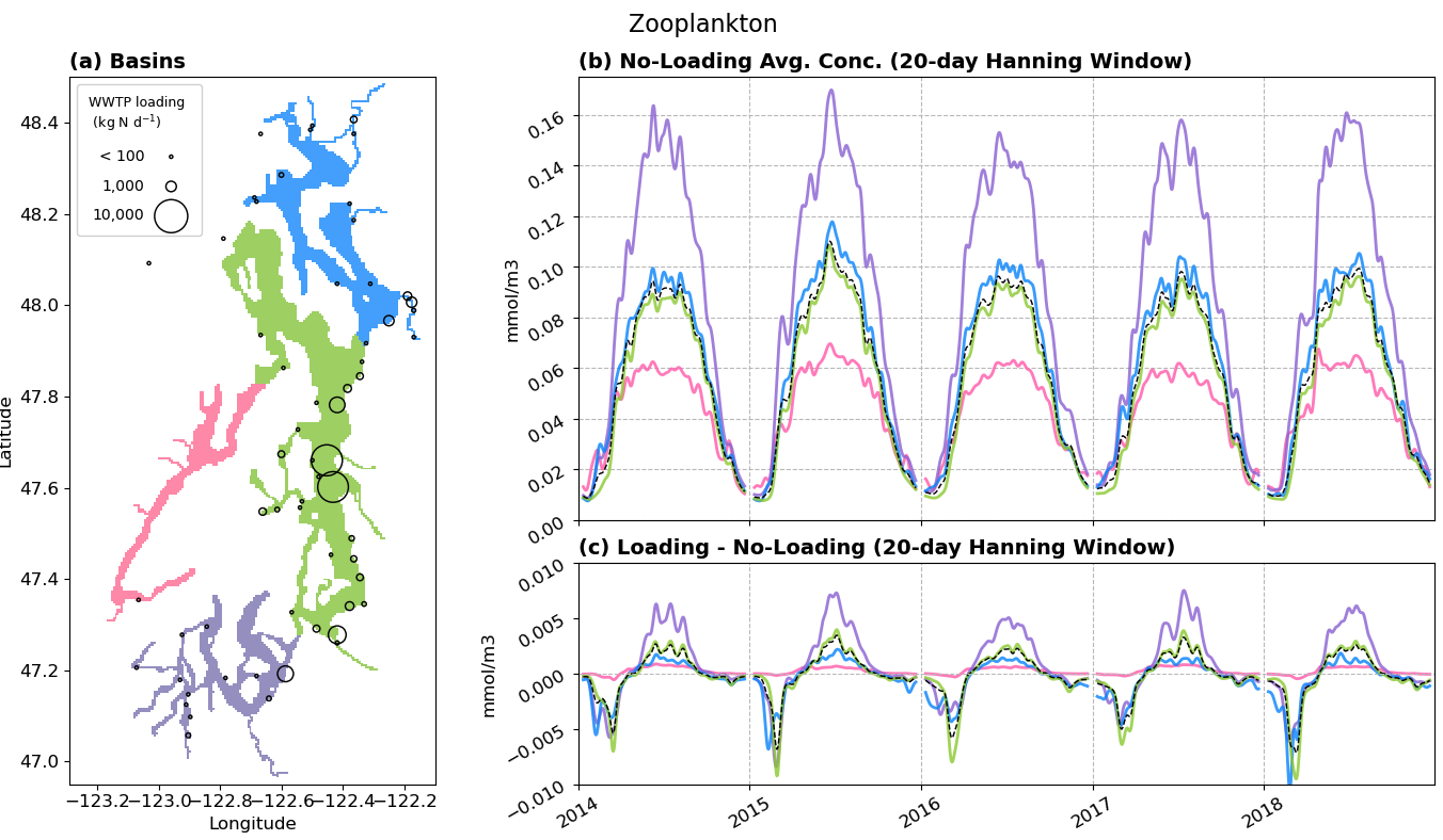
Fig 4. Average zooplankton concentration in the different basins of Puget Sound. (a) Delineation of basin boundaries and location & discharge of WWTPs. (b) Average concentration in the no-loading run, partitioned by basin. The black dashed line represents the whole of Puget Sound. (c) Difference between the loading run and no-loading run average concentrations.
Detritus
In LiveOcean, small detritus forms from dead phytoplankton and zooplankton. It then coagulates into large detritus as it settles. The deeper the basin, the longer the settling time, and therefore the more large detritus that forms.
In general, small detritus concentrations follow a similar pattern to phytoplankton concentrations. Hood Canal has the least amount of small detritus, while South Sound has the most (Figure 5b).
WWTPs cause a deficit of small detritus early in the year, and an excess of small detritus during the summer (Figure 5c). Once again, Hood Canal has the least impact from WWTPs. However, it has a considerable increase in small detritus during the summer months (which was not observed in the phytoplankton and zooplankton difference plots, Figures 3c and 4c). My hypothesis is still that most of the excess NH4 and small detritus are advected into Hood Canal, rather than sinking down from above– though more testing is needed to verify this hypothesis.
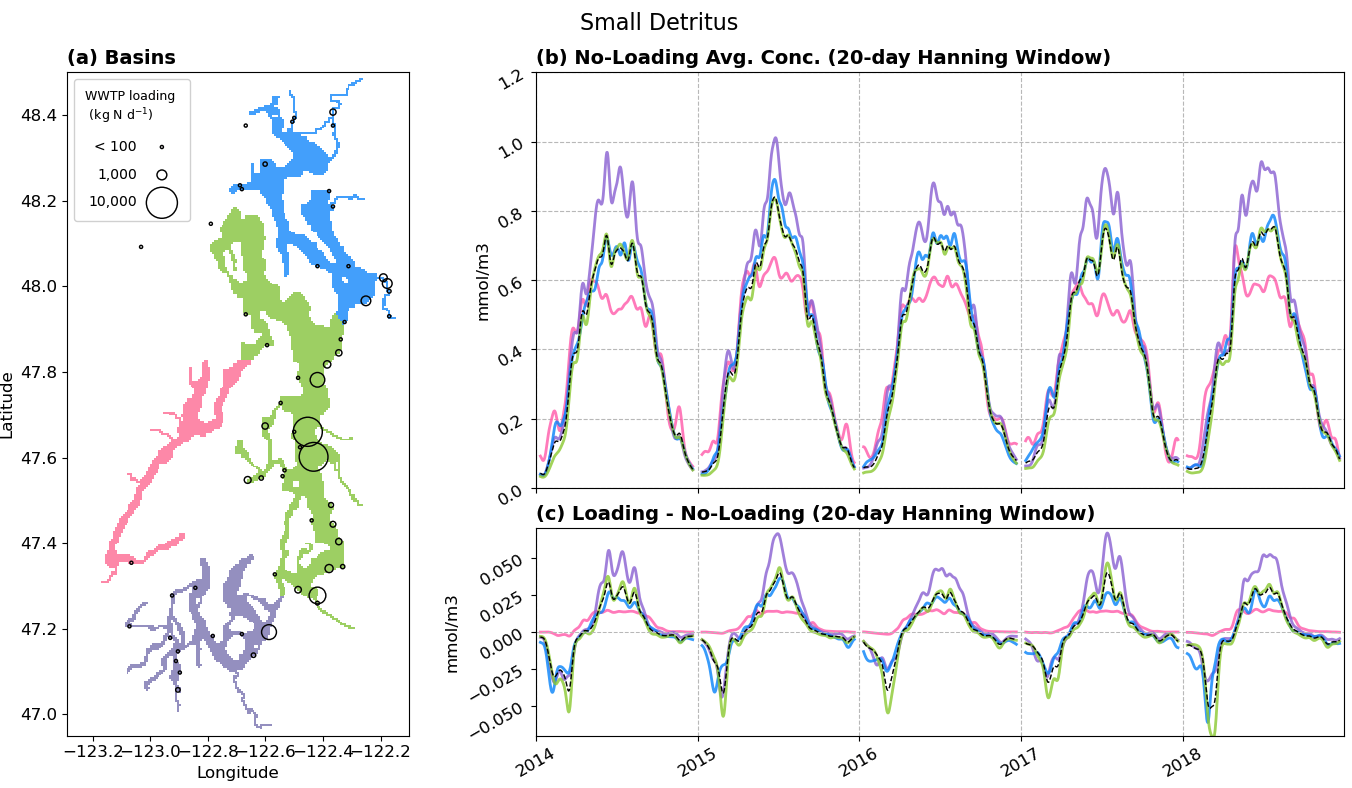
Fig 5. Average small detritus concentration in the different basins of Puget Sound. (a) Delineation of basin boundaries and location & discharge of WWTPs. (b) Average concentration in the no-loading run, partitioned by basin. The black dashed line represents the whole of Puget Sound. (c) Difference between the loading run and no-loading run average concentrations.
Large detritus has a different spatial pattern amonst the basins (Figure 6b) compared to small detritus. Main Basin has the most large detritus, presumably because it is the deepest basin– and thus there is more time for small detritus to coagulate into large detritus before it reaches the sediments.
The difference patterns of large detritus due to WWTPs (Figure 6c), is otherwise similar to that of small detritus.
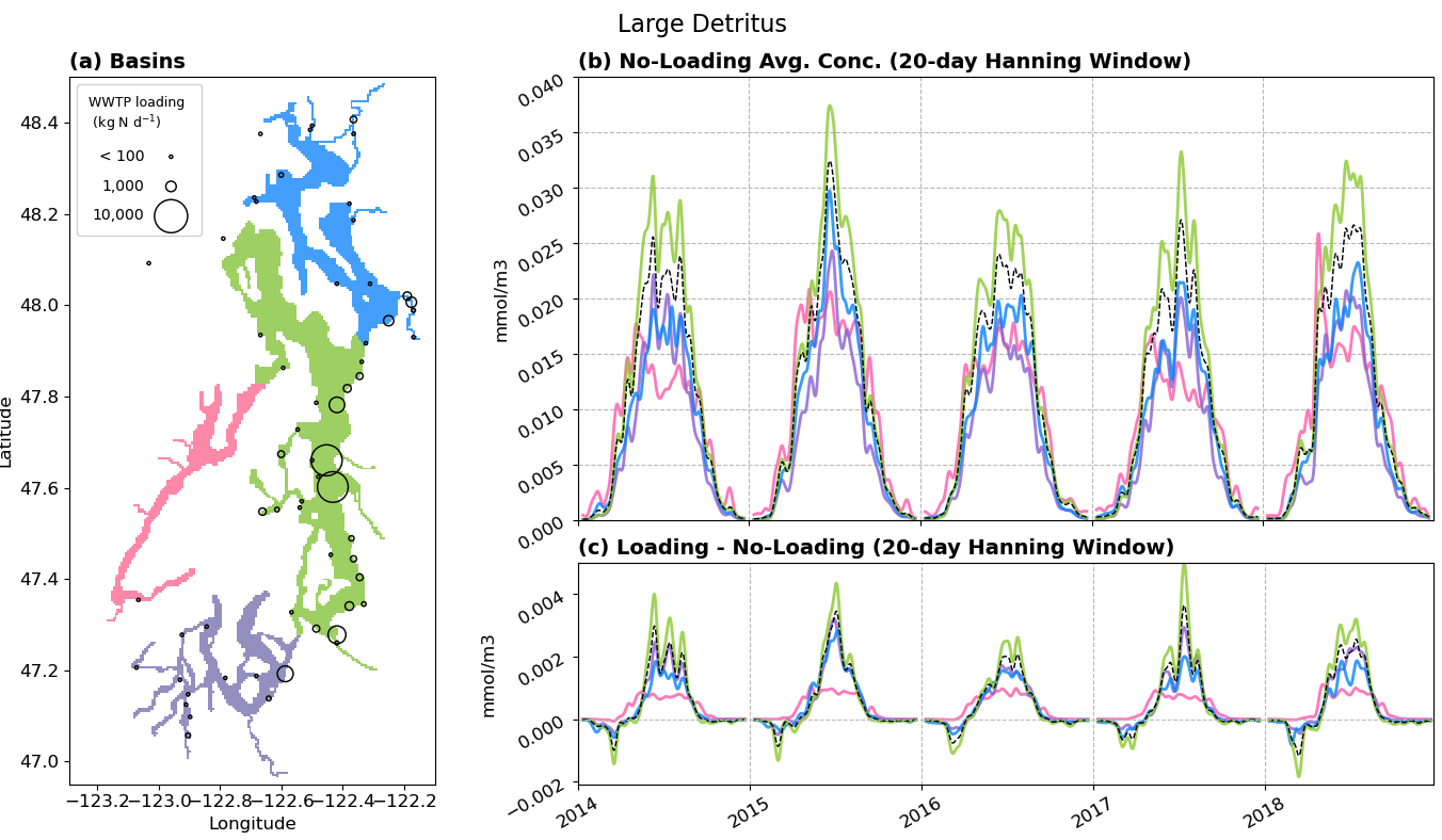
Fig 6. Average large detritus concentration in the different basins of Puget Sound. (a) Delineation of basin boundaries and location & discharge of WWTPs. (b) Average concentration in the no-loading run, partitioned by basin. The black dashed line represents the whole of Puget Sound. (c) Difference between the loading run and no-loading run average concentrations.
Oxygen
In the no-loading run, Hood Canal has much less oxygen compared to the other basins (Figure 7b). South Sound has the most oxygen, and Whidbey Basin and Main Basin have similar mid-level oxygen concentations.
WWTP loading decreases DO in all of the basins (Figure 7c). Despite having similar patterns for the other NPZD+O variables, Whidbey Basin and Main Basin have a different DO response to WWTP loading. In fact, Whidbey Basin’s DO response is most simlar to Hood Canals, and Main Basin has more resemblance to South Sound. Why? I’m not sure, and it is worth further exploration.
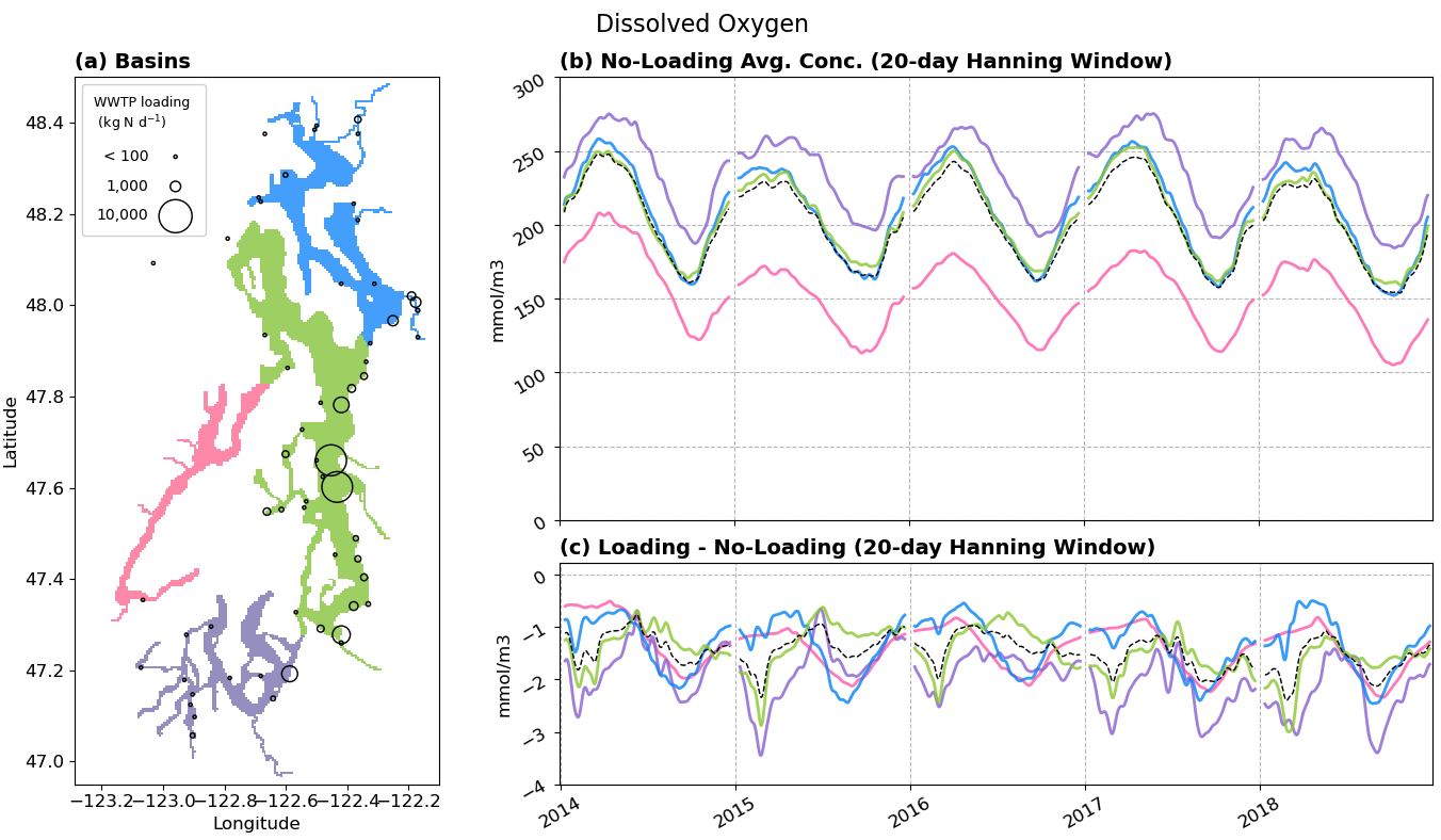
Fig 7. Average dissolved oxygen concentration in the different basins of Puget Sound. (a) Delineation of basin boundaries and location & discharge of WWTPs. (b) Average concentration in the no-loading run, partitioned by basin. The black dashed line represents the whole of Puget Sound. (c) Difference between the loading run and no-loading run average concentrations.
Improvements and Next Steps
- Finish extracting years 2019 and 2020 and add to this plot
- Merge the time series together before passing them through the Hanning Window filter. This will eliminate the weird gap in data at the beginning and end of every year
- Calculate the percent increase in land-based nutrient loads due to WWTPs, and compare that to the percent change in total nutrients in Puget Sound
- Plot bottom DO concentration maps (average, min concentration, and variability)
- Plot cumulative sum NPZD+O time series
- Re-run one year with hourly output so I can calculate TEF fluxes of NPZD+O variables at the basin boundaries.
- I will later need to adjust my basin boundaries so they match the TEF section locations. This should minimally impact the results presented in this blog post.