Plan for WWTP loading experiment
The focus of this chapter of work will be two-fold.
Part 1: How do WWTP nutrients impact DO?
Likewise, how do WWTP nutrients impact nutrient concentrations, phytoplankton, zooplankton, and detritus?
Part 1 will address how each of these state variables changes due to WWTP nutrients.
Part 2: What explains the spatial variability of WWTP impact?
For WWTP nutrients to impact DO in Puget Sound, the following processes must occur:
- nutrients discharged at depth must be mixed to the surface
- surface waters must then be sunny and quiescent enough for phytoplankton to grow
- organic matter sinks and remineralization consumes DO
Part 2 will address where these processes occur and ultimately explain the patterns described in Part 1.
Part 1: How do WWTP nutrients impact DO in Puget Sound?
Hypothesis: WWTP nutrients will tend to decrease DO (because nutrients fuel larger blooms, which will generate more detritus and lead to more oxygen consumption). However, the impact of the WWTP nutrients will be relatively small, because the vast majority of nutrients in Puget Sound come from estuarine exchange with the ocean, and DO is the end step of a sequence of biogeochemical processes.
I will break down this question into four steps:
- What fraction of nutrients do WWTPs represent in Puget Sound?
- What is the percentage change in TN and oxygen in Puget Sound?
- How does DO change between the Loading and No-loading runs?
- How do all NPZD+O state variables change in surface and deep waters across the different basins?
What fraction of nutrients do WWTPs represent in Puget Sound?
i.e., what does the WWTP loading experiment change to the total nutrient loads?
I have answered this question using TEF to determine the nutrient loads entering Puget Sound via estuarine exchange flow at Admiralty Inlet (Fig. 1).
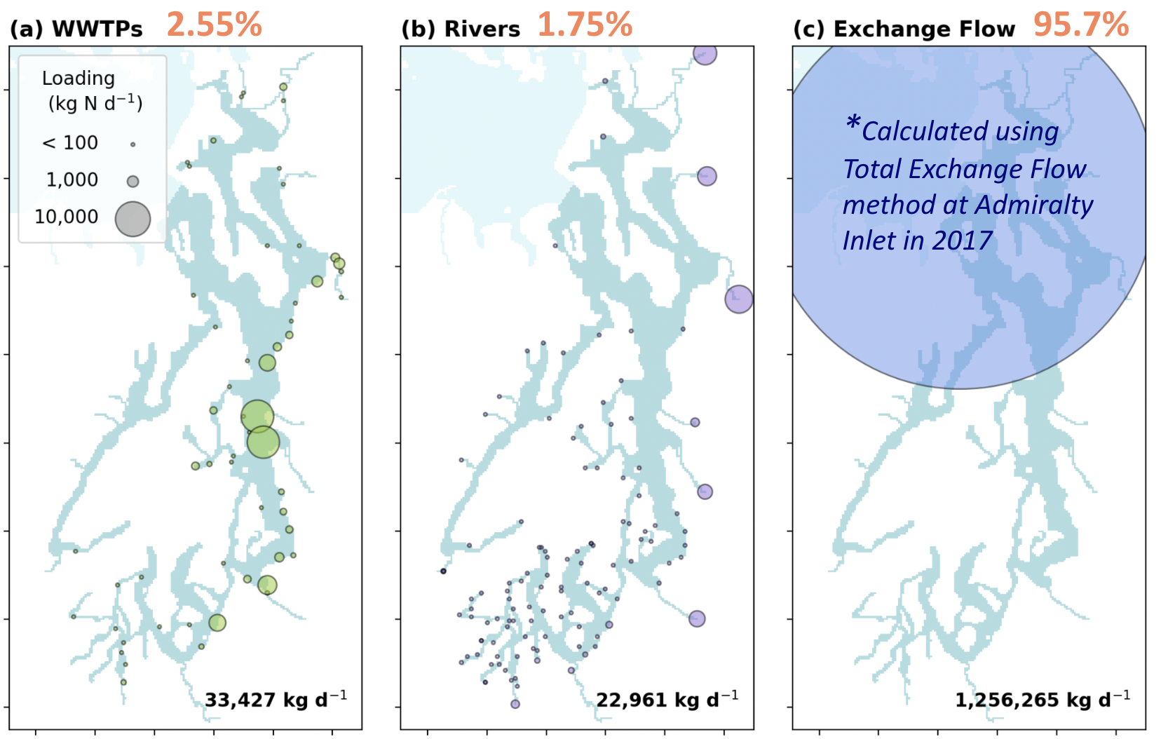
Fig 1. Nutrient loads entering Puget Sound from (a) WWTPs, (b) rivers, and (c) exchange flow with the ocean at Admiralty Inlet. WWTP and river loads were calculated from the average forcing inputs over the simulation period. Exchange flow load was determined using TEF at the mouth of Puget Sound. The exact location of the TEF section is indicated by the change in blue shading delineating the boundary of Puget Sound.
The river and WWTP loads are average forcing inputs over the entire simulation period. To improve this figure, I will calculate river and WWTP loads just for 2017, since I used 2017 hourly output for the TEF analysis.
As a follow-up, I will also compare the magnitude of the 2017 WWTP and river nutrient loads to the 2015-2020 averages, and I will compare the TEF results to prior literature (e.g., Mackas & Harrison, 1997; Sutton et al., 2013; Xiong et al., 2025).
What is the percentage change in TN and oxygen in Puget Sound?
I have previously answered this question by calculating the total nitrogen and deep DO concentrations averaged across the entire Puget Sound region over years 2015 - 2020.
| [mmol/m³] | No-loading | Loading – No-loading |
|---|---|---|
| Total Nitrogen | 28.29 | 2.12 (+7.4%) |
| DO (z > 10m) | 193.09 | -1.67 (-0.9%) |
To finish this line of work, I will determine a more appropriate dividing depth between surface and deep DO (see final sub-section of Part 1). Then I will calculate change in the photic zone and sub-photic zone, and also split these calculations by basin and by season.
I will also calculate these same values using just the year 2017 (rather than the whole 2015-2020 simulation period). The 2017 values should be directly comparable to the 2017 nutrient loads calculated in Figure 1.
How does DO change between the Loading and No-loading runs?
I have addressed this question with hypoxic volume time series and maps of bottom DO throughout the region.
Over 2015 - 2020, hypoxic volume in Puget Sound increased by an average of 0.09% (on days in which Puget Sound experienced hypoxia in the No-loading run).
WWTP nutrients change the climatological mean bottom DO concentration during Sep – Oct by -0.058 mg/L within Puget Sound (Fig. 2).
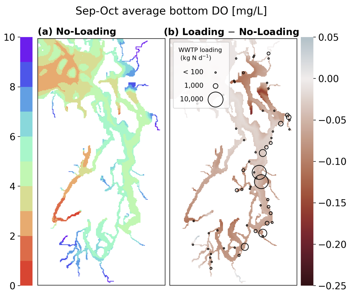
Fig 2. Climatological mean (2015-2020) bottom DO map averaged over September and October.
I will examine DO seasonally and across different basins with the work proposed in the following sub-section.
How do all NPZD+O state variables change in surface and deep waters across the different basins?
To answer this question, I propose comparing time series of each of the NPZD+O state variables, in surface and deep waters, across all of the different basins.
First, I will determine an appropriate dividing depth to separate the surface and deep waters. To do this, I will conduct a mooring extract at 3-5 different locations within each basin, and plot average phytoplankton profiles over the 6 years of model data. The goal is to identify the depth at which phytoplankton can no longer grow, and I will use this depth as a threshold to separate each basin into a (1) surface, phytoplankton-growing layer, and a (2) deep, consumption layer.
Then, within each layer, separated by basin, I will calculate a volume-integral of each of the NPZD+O state variables, and plot them as a time series to compare the magnitude and timing of key biogeochemical processes in each basin between the Loading and No-loading runs.
I will also plot a time series of cumulative phytoplankton, which resets at the start of each year. This time series will tell us whether the total amount of phytoplankton, and the timing of large bloom events, differ between runs.
Part 2: What processes explain the non-uniform spatial response in DO to WWTP nutrients, and where are these processes occurring?
Hypothesis: Exchange flow sets the spatial distribution of WWTP nutrients in the estuary, where nutrients discharged at depth tend to travel up-estuary until they reach the strong mixing zone at Tacoma Narrows, which brings nutrients to the surface. These nutrients are then transported down-estuary by the exchange flow, generating phytoplankton blooms along the way. When these blooms decay and produce sinking detritus, the deep detrital matter gets transported back up-estuary and gets distributed to Whidbey Basin. Long retention times in Whidbey Basin lead to disproportionately greater DO depletion due to WWTP nutrients compared to Main Basin. Conversely, the exchange flow has a harder time distributing organic matter to Hood Canal and South Sound due to the entrance sills at their mouths.
I envision breaking this question down into three steps:
- Where are nutrients discharged at depth being mixed to the surface?
- Where are phytoplankton growing?
- Where is the organic matter accumulating, and where is DO being consumed?
Where are nutrients discharged at depth being mixed to the surface?
To answer the first question, we need to understand where mixing occurs. I propose that we create maps of the average vertical turbulent flux of NH4 during 2017 at a depth just below the photic zone. This depth will have already been determined from the mooring extractions in Part 1 above.
At this depth, we can then approximate the flux of NH4 using the gradient-diffusion hypothesis:
\[Flux = -AK_s \cdot \frac{\partial}{\partial z} (NH_4)\]where AKs is the eddy diffusivity, which is a ROMS output. Note that AKs is the eddy diffusivity for salt, and I am using it as a proxy for the eddy diffusivity of biological tracers (which is not one of the LO output variables).
We can then make maps of this NH4 flux at the depth just below the photic zone. I propose using this depth because nutrients are only relevant to phytoplankton growth if they can be mixed into sunlit waters.
As an example, Figure 1 plots the NH4 flux at -10 m at a single hourly snapshot on 2017.02.12. Mixing hotspots include Admiralty Inlet, Tacoma Narrows, and throughout Main Basin. Mixing is particularly weak in Hood Canal and Whidbey Basin (Fig. 1a). WWTP discharges tend to increase upward NH4 turbulent fluxes at Tacoma Narrows and Main Basin near South Seattle, but decrease the fluxes in Admiralty Inlet.
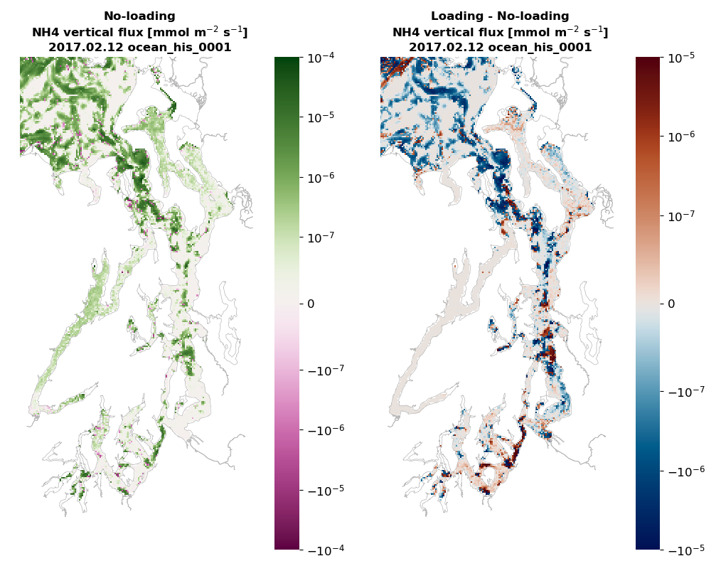
Fig 1. NH4 vertical turbulent flux at a depth of approximately -10 m for (a) the No-loading run and (b) the Loading minus No-loading run. Regions with depth shallower than 10 m are masked out. Note that the colorbar is in log scale, with a linear scale between -10^-7 and 10^-7.
To obtain average NH4 flux throughout 2017, I will extract hourly NH4 flux at the desired photic zone depth for all of 2017, then pass these values through a Godin filter. Afterwards, I will create annual average and seasonal average maps, similar to the one shown in Figure 1.
Lastly, I will verify that the locations of high NH4 flux are truly the locations where WWTP nutrients are being mixed to the surface. To do this, I propose launching a small particle tracking experiment that traces where discharges from the 5 largest WWTPs in Puget Sound go after release.
Where are phytoplankton growing?
After determining where WWTP nutrients get mixed to the photic zone, we then need to determine where they fuel blooms. For this, I will create surface chlorophyll maps and difference the maps between the loading and no-loading runs.
Using data from 2015 through 2020, I will create monthly climatological mean maps of surface chlorophyll concentration. These monthly maps will always include a panel with values from the no-loading run, and a second panel with the difference between the loading and no-loading runs.
Since we have higher temporal resolution output for 2017, I will conduct more detailed chlorophyll comparisons for this year.
- First, I will create maps of the cumulative amount of chlorophyll that the surface waters held throughout the year 2017. This map will allow us to compare the intensity and locations of blooms between the loading and no-loading runs.
- Second, I will create a sequence of maps spanning the peak bloom period (TBD). For illustration, let us assume that the peak bloom period spans four weeks. In this case, I would plot average surface chlorophyll, and the difference in chlorophyll between the two runs, on a single day of each of the four weeks. This will give us four snapshots that will show us a comparison of the time-evolution of the spring bloom.
Along with the cumulative sum time series of phytoplankton from Part 1, these maps will show how the location, timing, and magnitude of phytoplankton blooms vary between the loading and no-loading runs.
Where is DO being consumed?
Lastly, I will evaluate where DO is being consumed. For this work, I will return to the time series of NPZD+O state variables from Part 1. These volume-integrals are essentially a “storage” term for each of the NPZD+O variables.
I will compare the 2017 time series of NPZD+O state variables in each basin to the net flux of NPZD+O variables into each basin using TEF at the basin boundaries. We already have hourly model output for both the Loading and No-loading runs for 2017, allowing TEF analysis to be an option.
By comparing these sets of time series, do we see any relationships between what is being transported in/out of the basin and how much of each NPZD+O state variable is accumulating in each basin? Is detritus increasing in one particular basin due to large influxes into the basin and minimal phytoplankton decay? Do these relationships change between the Loading and No-loading runs?
The main point is identifying whether the organic matter that is being consumed is produced locally or advected in, and whether low DO conditions are generated locally or advected in.
I acknowledge that this analysis sounds like it should be a full budget analysis of the NPZD+O state variables in each basin. While a proper budget analysis of the NPZD+O state variables is a more rigorous method of conducting this analysis, I also see high complexity in splitting a TN budget into the separate NPZD state variables.
Holmes Harbor case study
In addition to analysis at the basin scale, I plan to conduct a case study in one inlet.
Holmes Harbor is one of the most strongly impacted locations in Puget Sound (Fig. 2). Thanks to Paper 1, I already have all of the code I need to create a DO budget for Holmes Harbor, and I have already completed the budget for the Loading case (Fig. 4).
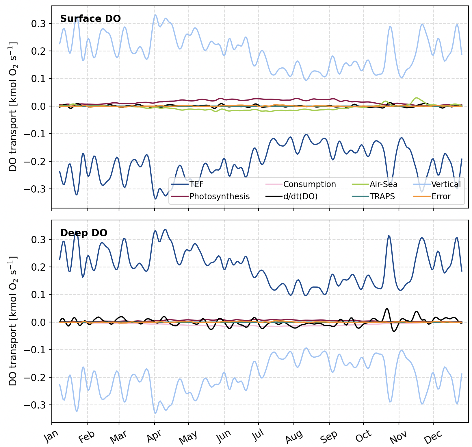
Fig 4. Holmes Harbor surface and deep layer DO budgets during 2017, as calculated for Paper 1. A 10-day Hanning window has been applied to the time series.
Imagine two additional panels on this plot that show the difference in each DO budget term between the Loading and No-loading runs. This difference time series will tell us which budget terms are causing Holmes Harbor to be impacted by WWTP nutrients. For instance, do we see stronger consumption rates but minimal change to photosynthesis and DOinQin? In this case we would conclude that DO decreases because more organic matter is being consumed in the inlet. Alternatively, do we see the largest change to the QinDOin term, suggesting that the strong impact to Holmes Harbor is due to less DO being supplied by the exchange flow.